FORMAL ELEMENTS IMAGE SEQUENCE + ANALYSIS
Sequence 1
Focal Point
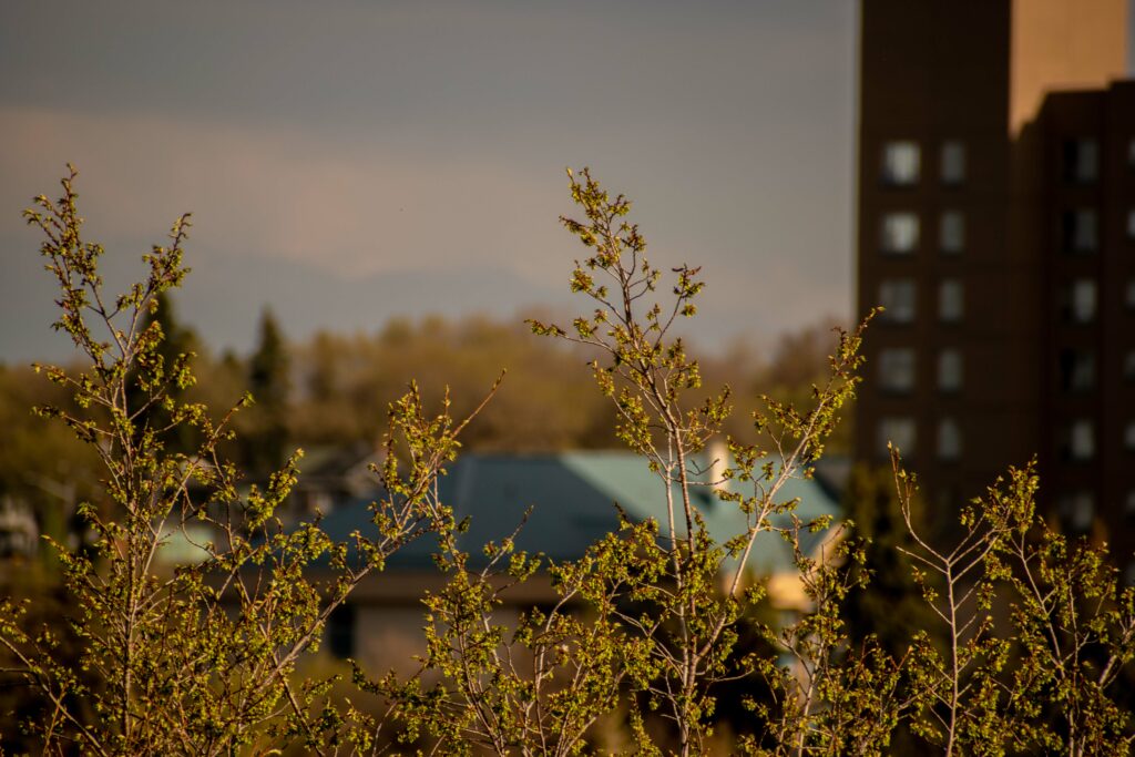
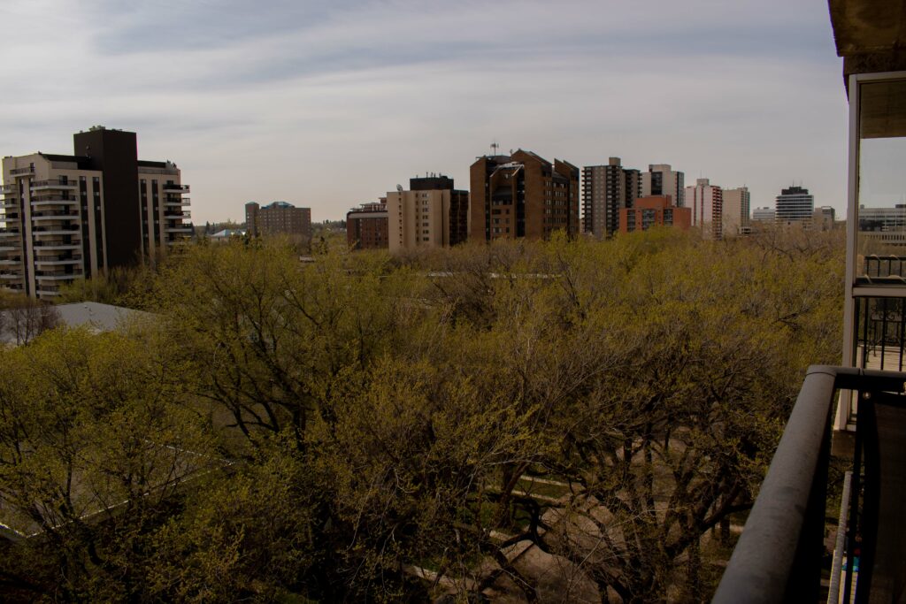
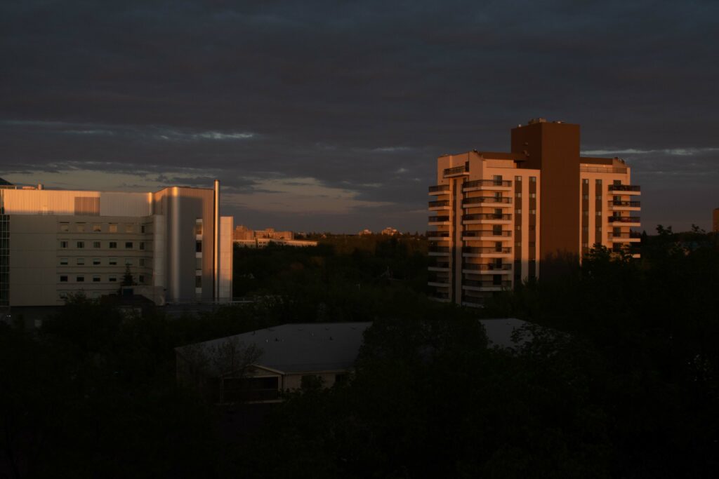
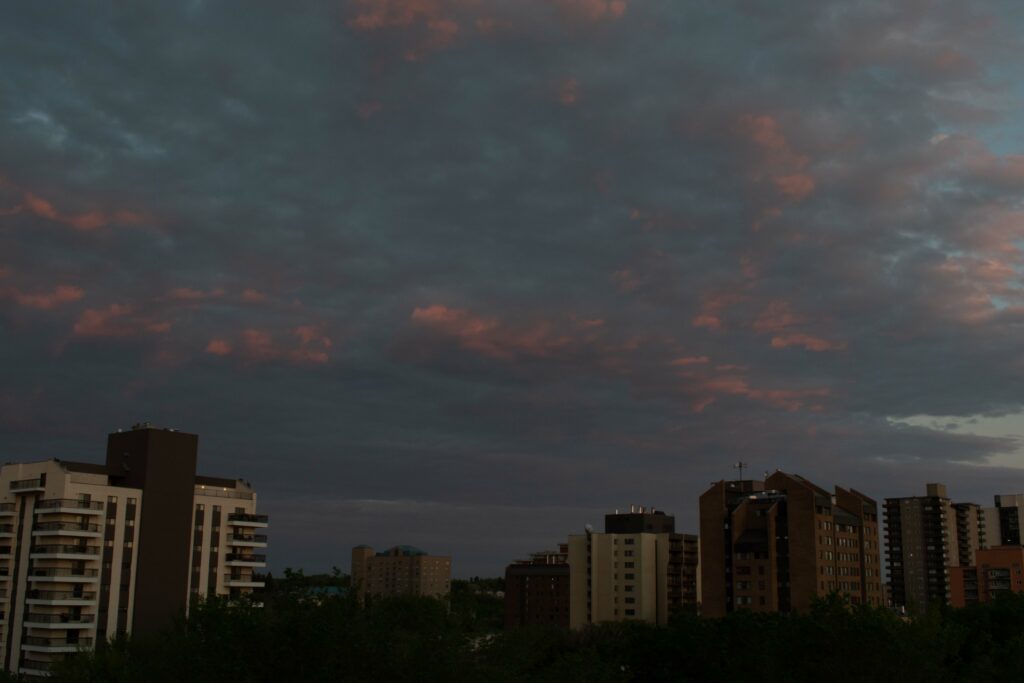
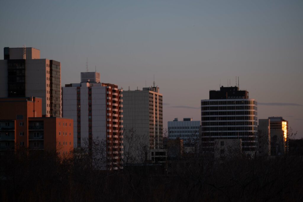
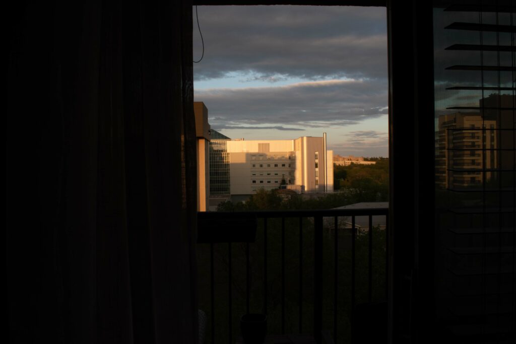
This sequence uses differing perspectives on city buildings and surrounding trees, sky, and landscape. In the first image the focal point is on the highest branches , with the buildings out of focus in the background. The focus of the second image is the sun-lit building with the ominous clouds above it. The Third image has its focus with the three elements of trees, building, and sky. The next picture in the series is again focused on sun-lit buildings with darkened sky overhead. The fifth image features the sky with its clouds dominating the shot, and the buildings are anchored to the bottom of the picture. The last picture in the series, shows calm sky with the focal point as the buildings in the center. The trees in this shot are on the bottom and create a shadow effect. Although all pictures show unique perspectives, they are tied together by the city scape within nature theme.
Negative Space
The series explores negative space in its use of shadow and sky and the different perspectives. Most of the shots show all elements of sky, buildings, and trees, but in varying degrees of brightness and focus. This is meant to showcase the differing depths and create a sense of repetition in the series.
Line
Line is used through the architectural images of the high-rise buildings with texture built into the series through the clouds and tree branches. Light is an important element in this series as some pictures depict and brightly lit building, yet a darkness in the cloudy sky and dark shadowy trees. The first image, however, differs, as the light is focused on the branches and the sides of the unfocused buildings.
Sequence 2
Negative Space
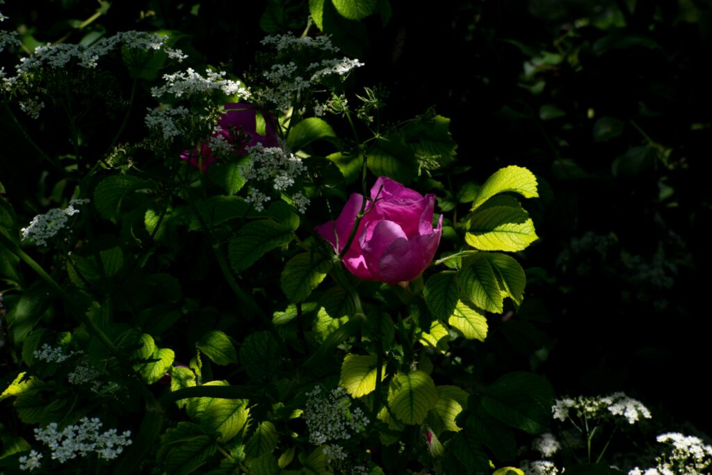
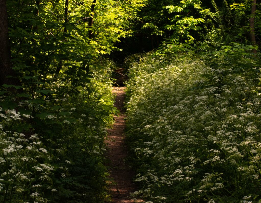
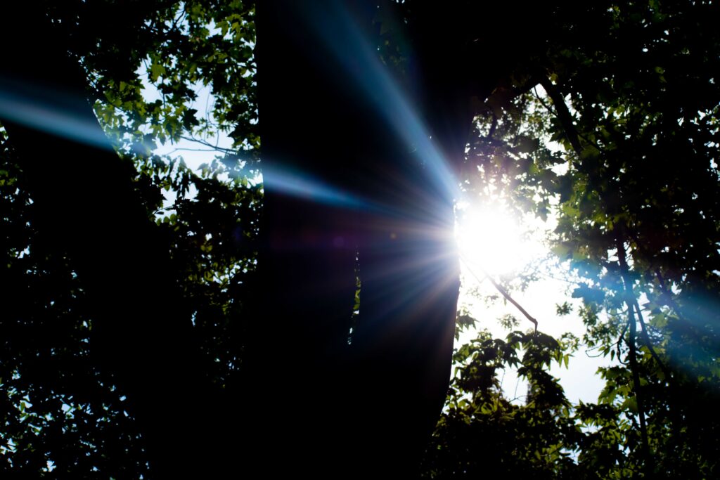
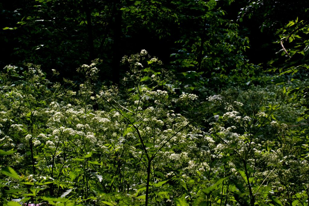
This sequence explores the theme of nature. Light is a major component of this series. I believe that nagative space is created by the use of shadows. The flower and leaves are lit by the sun as the focal point with the surrounding area in darkness. This creates interest and draws the viewers eyes to the center. Likewise, the second picture uses light and line to create visual interest as the path is lit and encourages the eye to look from the bottom to top as the picture gets progressively lighter with the sunlight increasing on the path. The flowering bush on the sides create textural interest. The next picture explores light as it reflects its beams through the darkened branches, creating visual interest of lightness and darkness. The fourth picture has its focus on the flowering bush with the use of greens and white images.
Depth
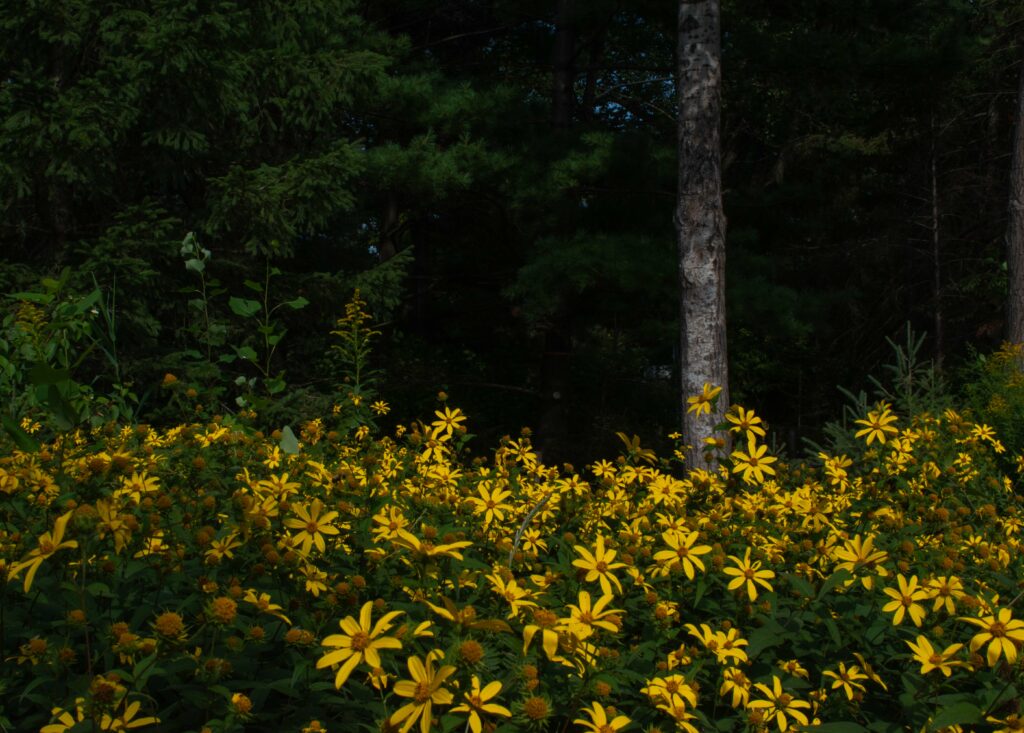
The background is darkened, which allows for the focal point and creates a sense of depth. The last picture changes the colour scheme with use of yellows against the green. It also has a darkened background that heighten the depth of the picture.
Colour
The colours of green, both light and dark, unite this series. Texture is created through the natural elements of the plants. There is repetition used through both the theme and through the elements of colour, texture, and light verses darkness.
FRAMING SHOT SIZE + ANGLES
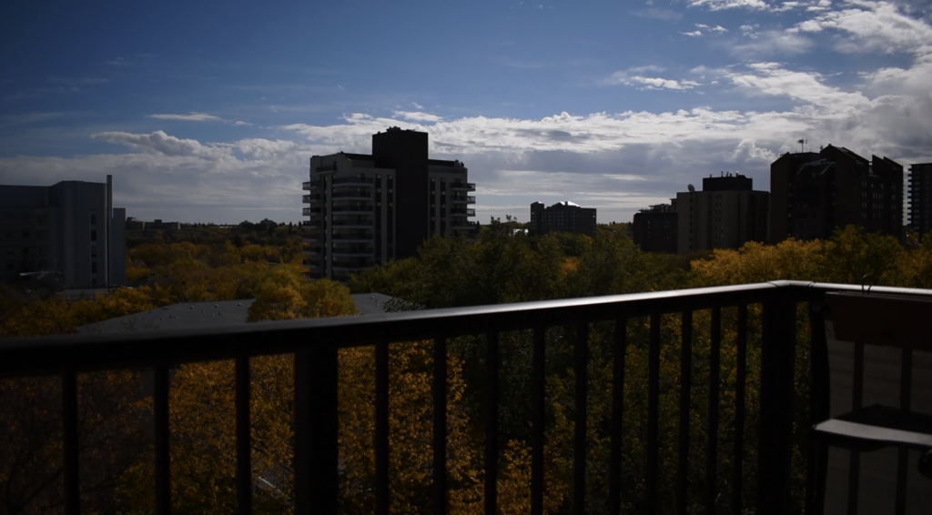
Establishing Shot, eye level 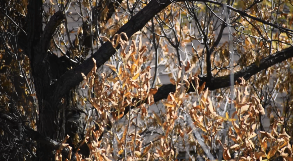
extreme close up, bird’s eye 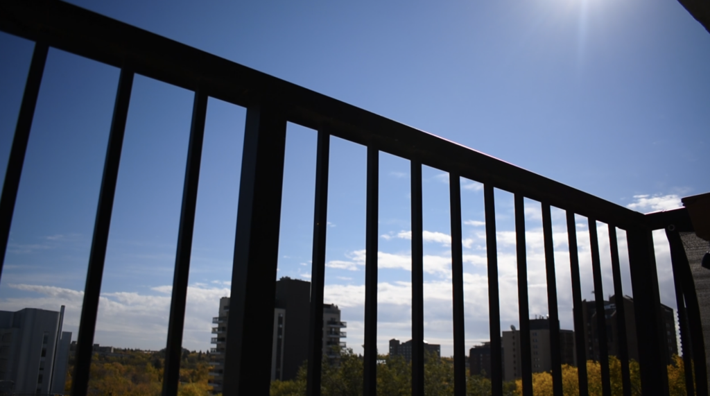
wide shot, worm’s eye 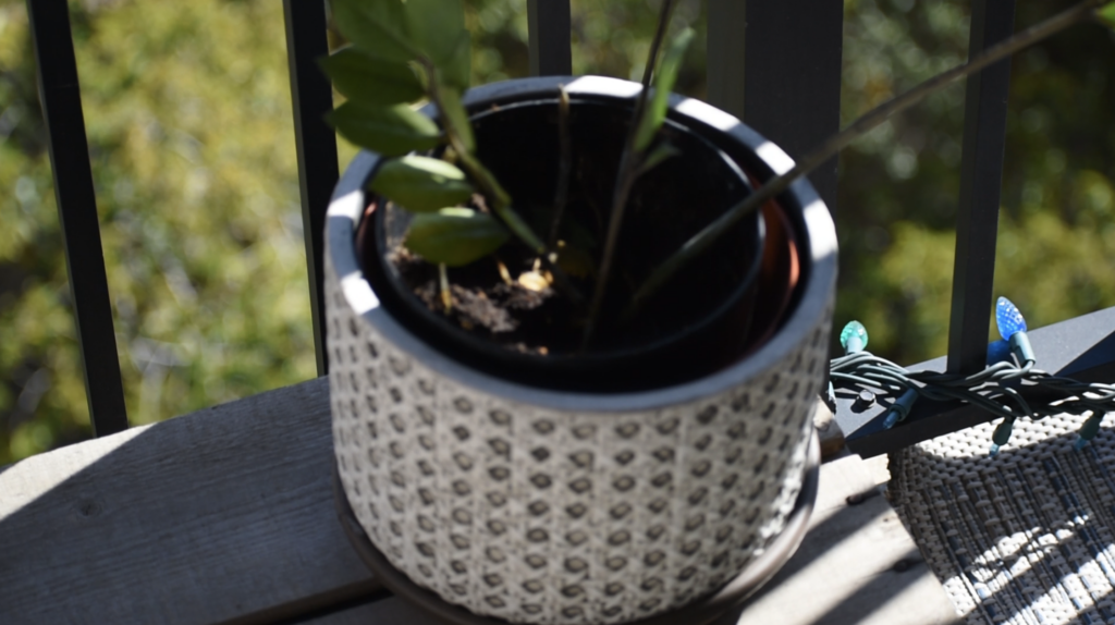
medium full shot , overhead 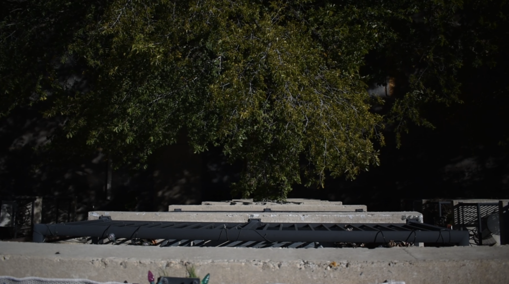
full shot, overhead shot 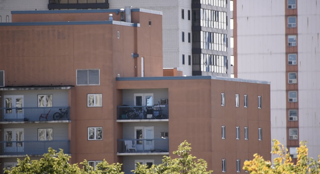
medium close up, eye level 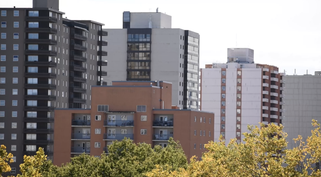
medium shot, eye level 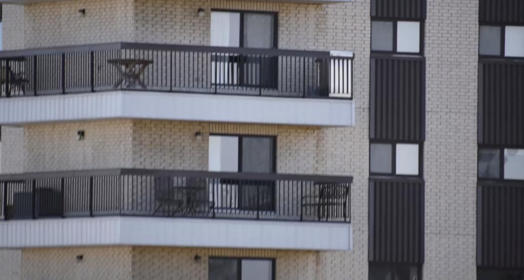
close up, eye level
Week 3
Project Proposal
Storyboard 1:
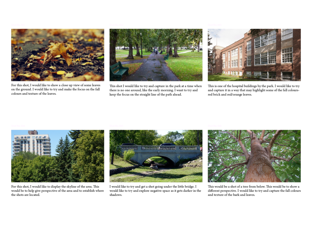
TECH Exercise: VIDEO Basic Editing
Storyboard 2:
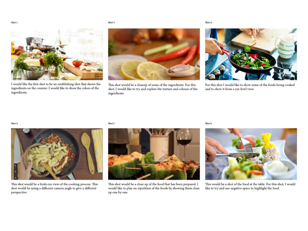
Tech Exercise: SFX + COLOUR + BLENDS
Tech Exercise – Sound Basics
The Fits: A Review
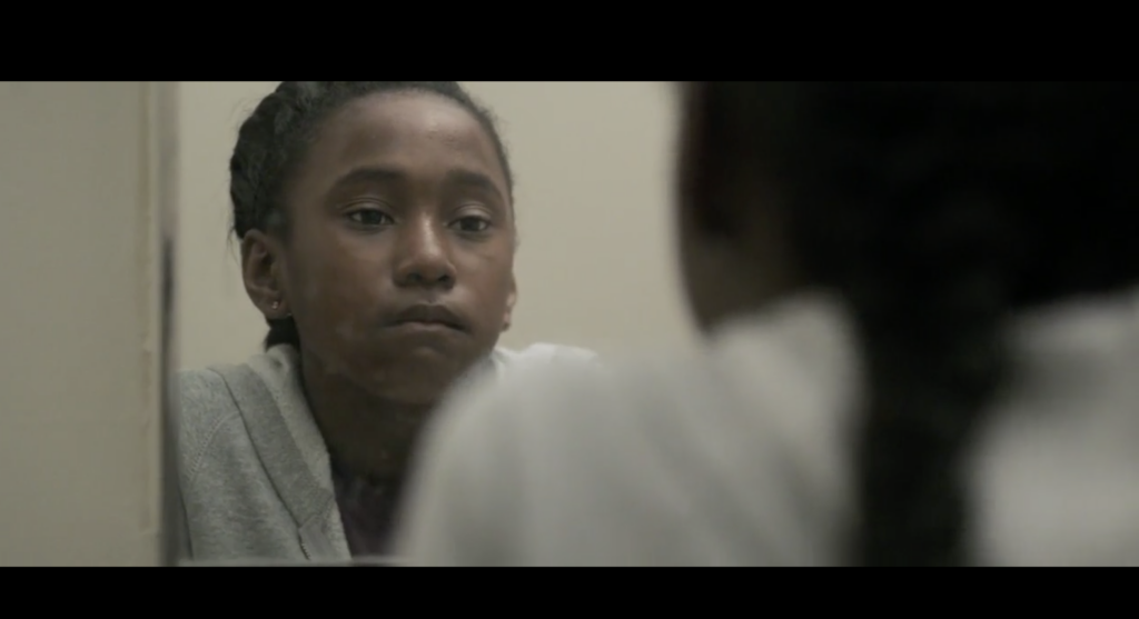
I believe that the main themes of this film are surrounding adolescence and personal discovery. The main character of the film goes from being interested in boxing with her brother, to joining a girls dance group.
I felt most captivated by the main character because of her curious personality and how the viewer is able to see her develop her skills and confidence in dance.
I believe the film used the colours blue and purple a lot when focusing on the young dancers. I noticed that the older characters were often dressed in warmer colours.
I feel as though the film used space as a way to show how young and small the main character is. When she is talking to her friend in the gym, the entire gym is within the frame, which helps to emphasize their age and being small and young.
I enjoyed this film because I was left wondering the true meaning behind “the fits” or illness that the characters were experiencing. When the main character experiences her “fit,” it seems as though she is seeing what she desires to happen for herself. I would like to rewatch this film again to see if I pick up on any other meanings.
Tech Exercise: Titles
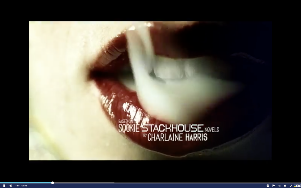
Title Sequence Review: Trueblood
The opening titling sequence of Trueblood gave off a very creepy and dangerous/mysterious vibe because of the scenes which showed an isolated swamp. The scenes used in this opening used a lot of neutral colours to give a creepy look to the locations.
The text that was used was slightly edgy and angular with uneven thickness which I feel helped to complement the creepy and mysterious theme. The scenes seemed to change quickly with the text quickly fading in and out which gives a more alarming vibe. The text size is varies slightly with each word, which helps add an unpredictable and hectic mood to the scenes.
The elements that stood out the most to me were symmetry because the scenes are all shot in a very asymmetric style that I feel complements the mysterious and bad theme. I also noticed that although the scenes are very neutral, the colour red is used a lot to make scenes stand out (i.e. the two little boys with bloody mouths). The scenes are also shot very close up which I feel helps make the viewer question the context of what they are seeing.
Title Sequence Review: Bron Broen
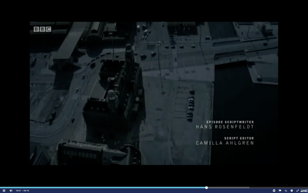
The opening titling sequence for Bron Broen has a very sad and lonely mood. The music is very soothing and sad and goes well with neutral/colourless shots of the city. The colours used throughout this intro were very dark and neutral.
The text that was used was very thin and modern. I feel like the font used complemented the lonely theme well because of the white colour and minimal look. In each shot, the font fades in and out very slowly which I feel like helped to give the sad mood.
Elements that stood out for me were black and dark shades used that gave off a sad feel, and the use of lines to display the city images, which switch angles as the viewer is shown different perspectives from different angles of the city. Negative space was also used a lot to show views of the dark city, which I feel also helps to add to the lonely theme.
